Creating a memorable logo or brand mark that resonates with the right audience and captures the essence of the company, product, or client.
Responsible For: Graphic Design | Market Research | Creative Direction| Brand Strategy | Trade Mark Research
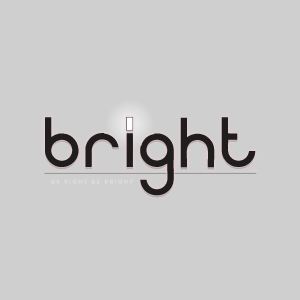
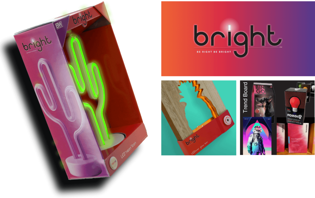
Bright ™
Designed for a growing line of fun LED lights for young adults and teens. It’s hard to miss this look on the shelf!
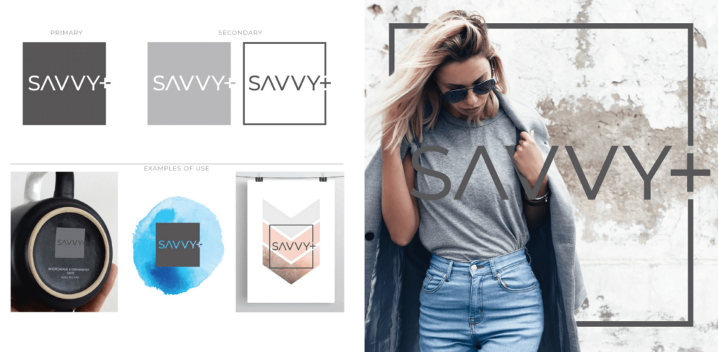
Savvy+ ™
Designed to be used on a large variety of home and tabletop goods. Savvy+ works well in large box stores and small boutiques.
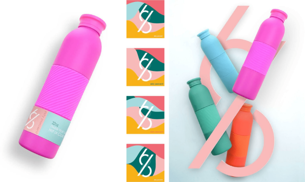
Sixty Percent ™
Designed for a hydration line that targeted health-conscious, on the go, women.
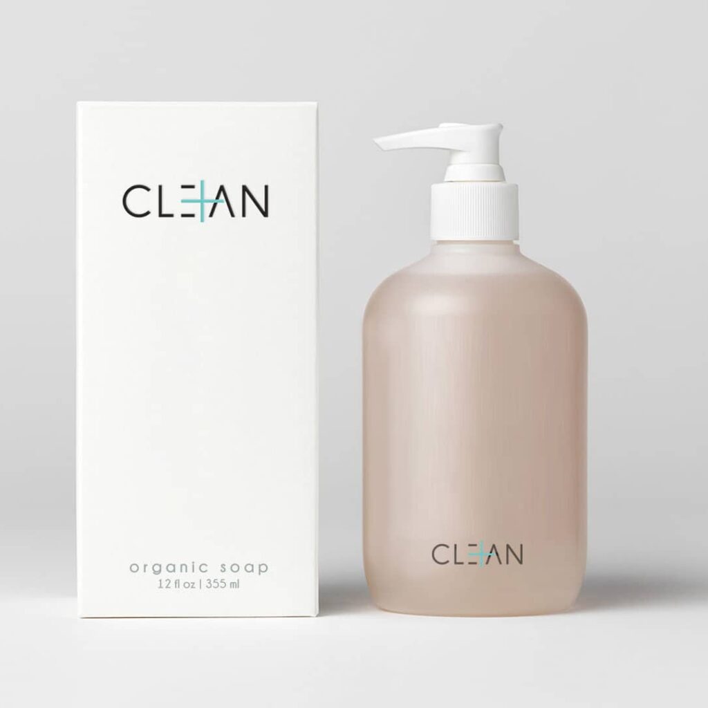
Clean ™
Designed to breathe new life it to a line of cleaning products that were cycled in and out of markets over a decade. The value of rebranding to this look was not recognized by the client and died there.
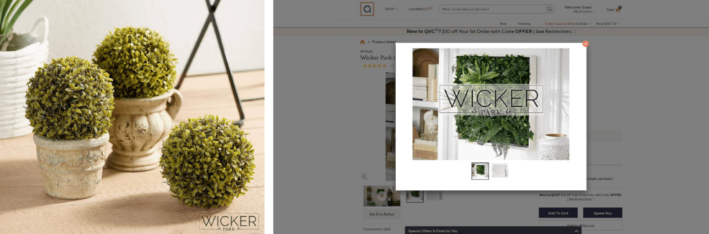
Wicker Park ™
Bethlehem Lights turned to me to design a mark for their new line of faux plant decor for QVC.
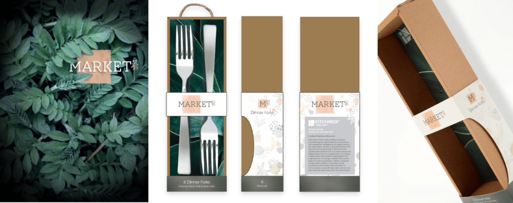
Market St. ™
Designed to be a disruptor in the flatware space, which tends to lean heavily masculine.
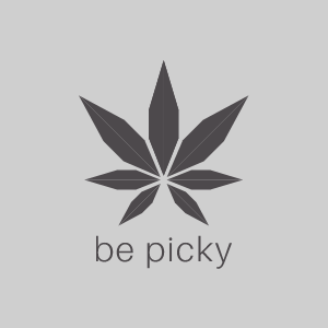
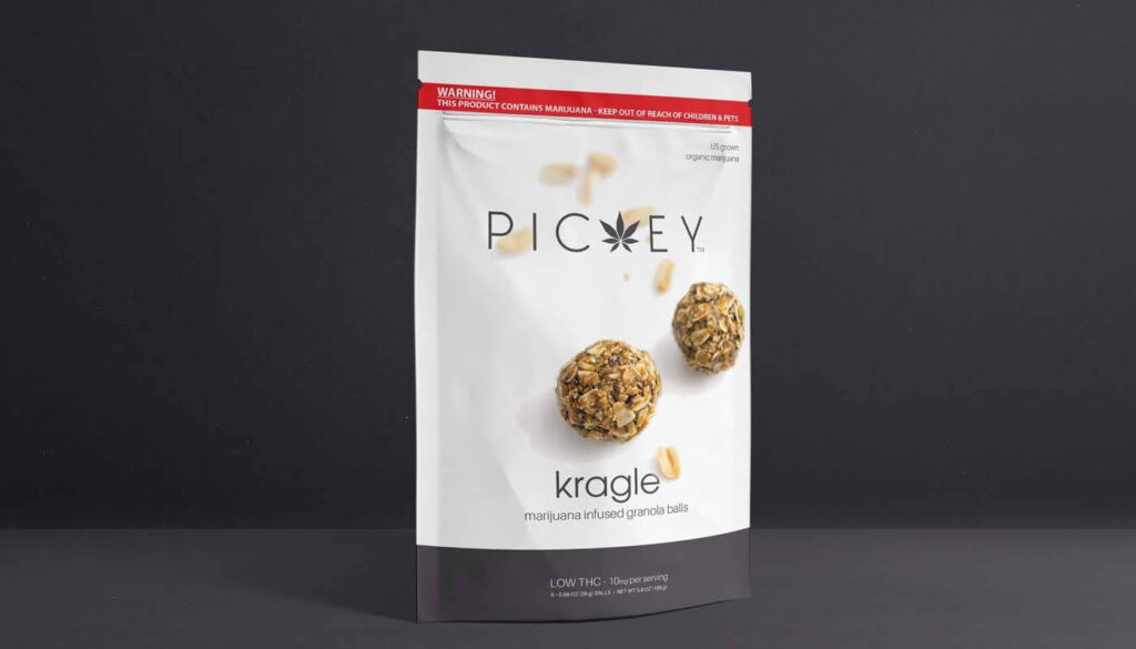
Pickey ™
It was becoming clear in late 2014 that cannabis was going to be an emerging market in Massachusetts. I went to work on learning the packaging and marketing laws by making it a design challenge. The goal was to design a brand that spoke to the business professional.