loader image

Home Décor & Gift

The ask:

To constantly introduce new brands, packaging, marketing and products into the Home Décor / Gift market, that are fresh, on-trend and consumer-driven.

Overall Responsible for:

Logo/Word Mark Designs – Creative Direction – Market Research – Brand Strategy – CPG Engineering – Photography – Copy – Production – Specing and Proofing – Cost and Scheduling 

My designs have been feeding this beast of a market since 2008

With buyers looking for new items monthly, it has kept me more than busy. I have worked with all the major retailers and online markets alongside mom & pops and Boutiques, and keep all of their clients in mind. You can still find some of my first work at stores across the country, including Mexico and Canada.

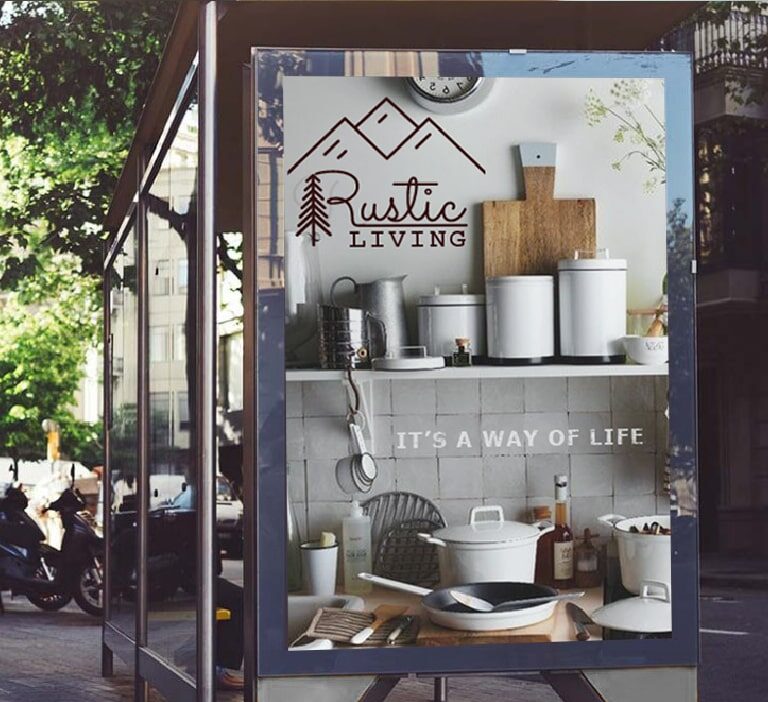
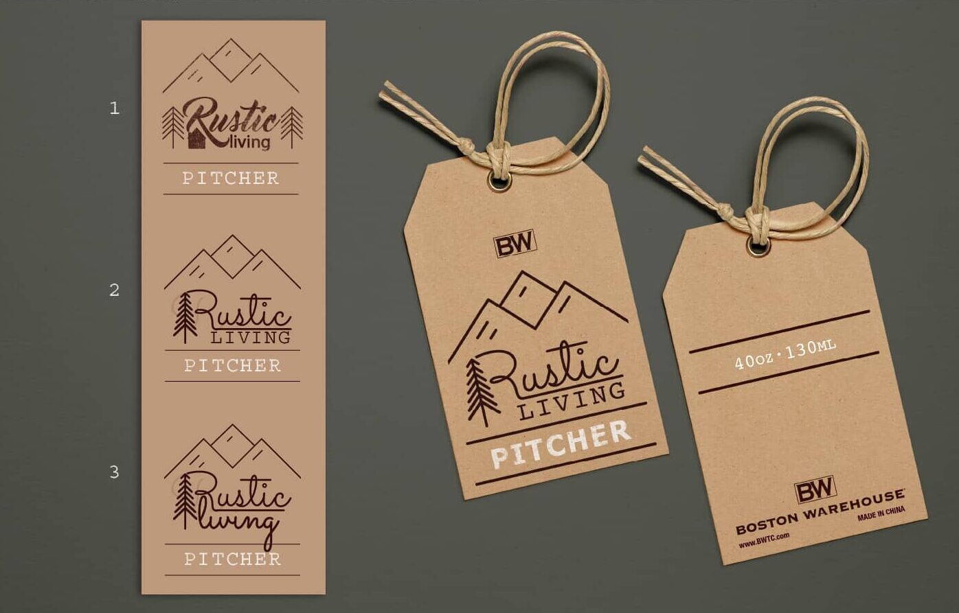
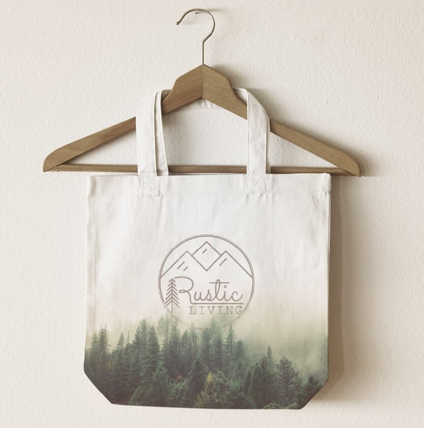
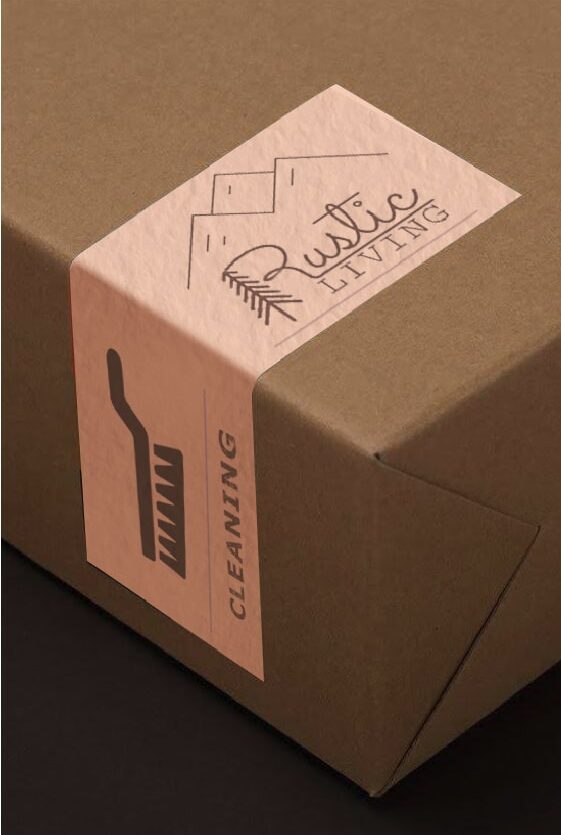
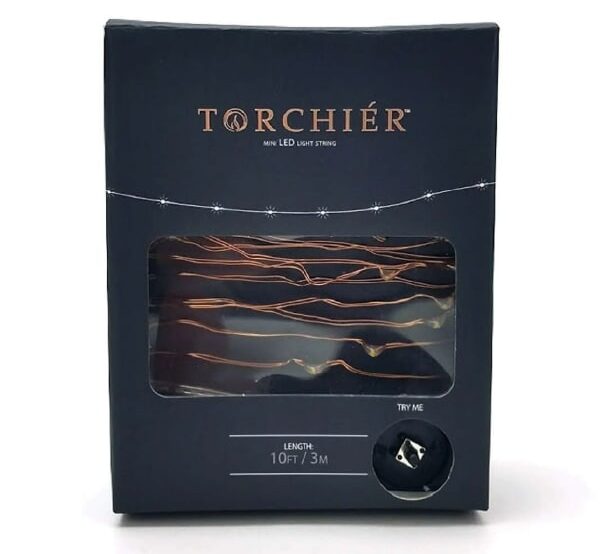
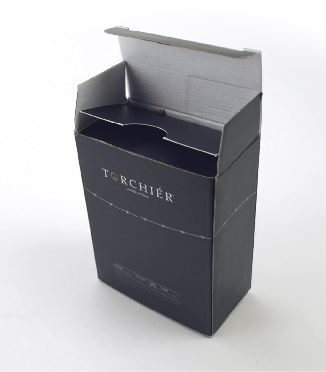
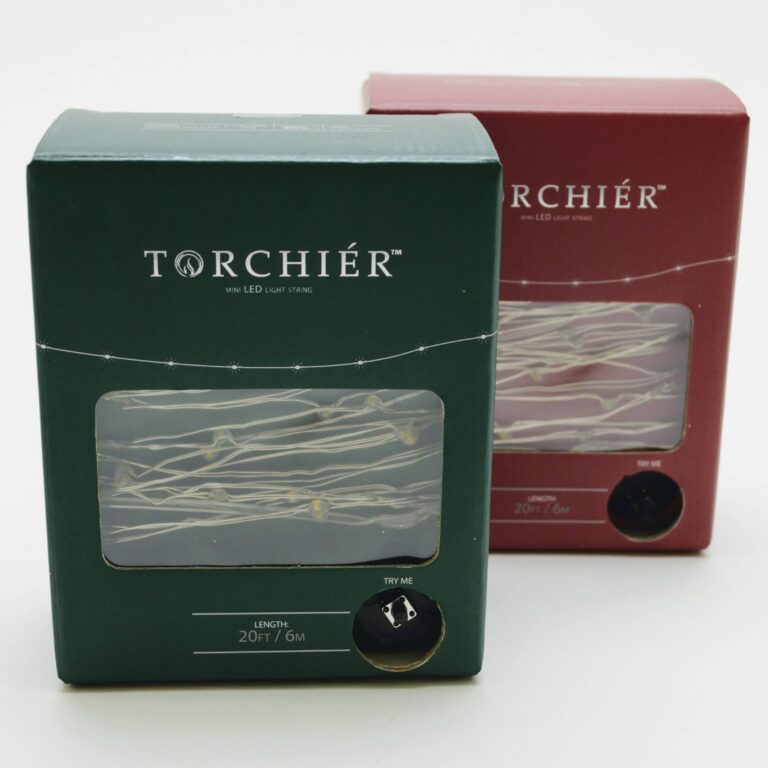
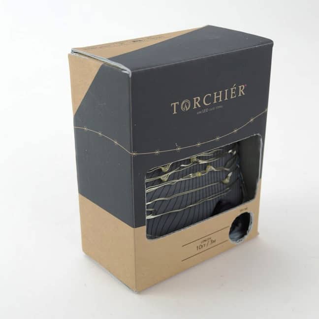
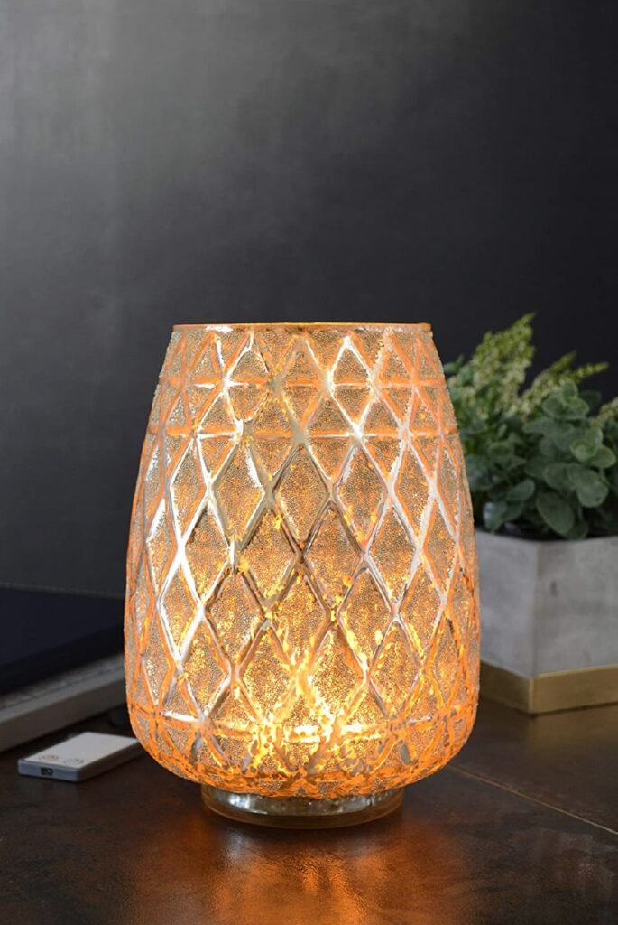
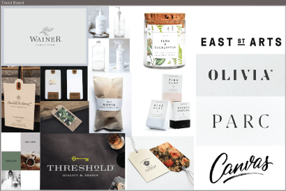
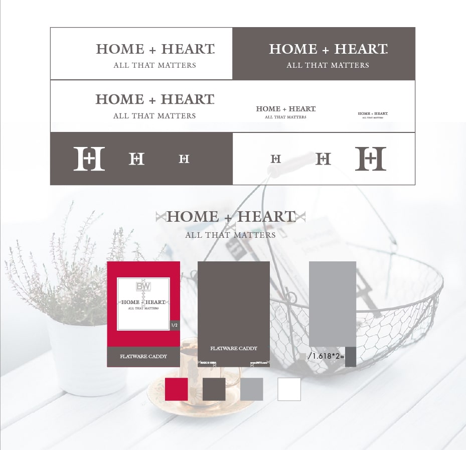
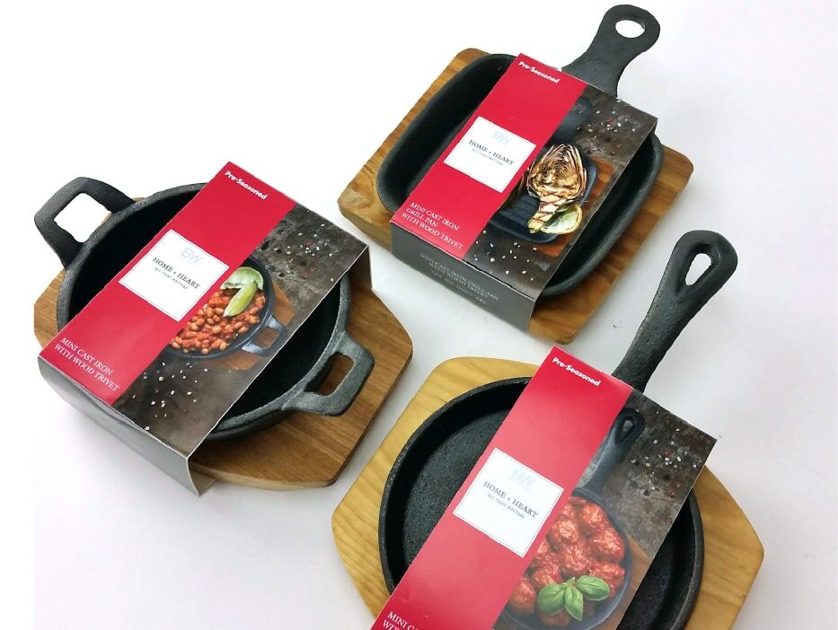
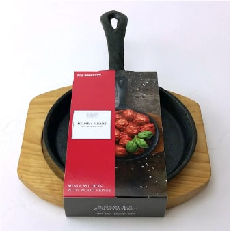
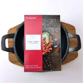
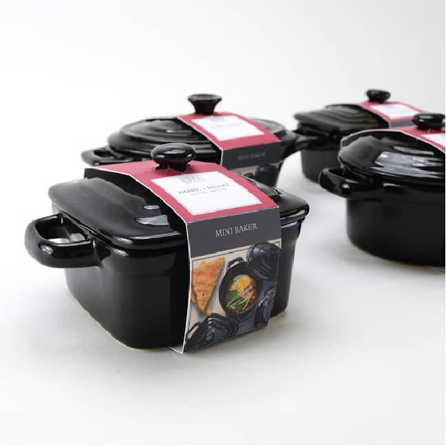
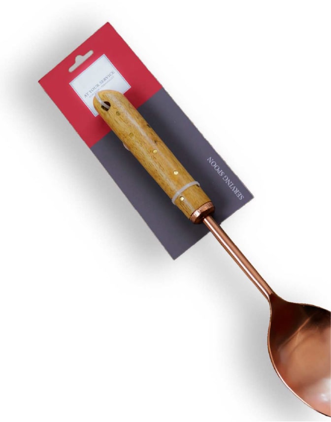
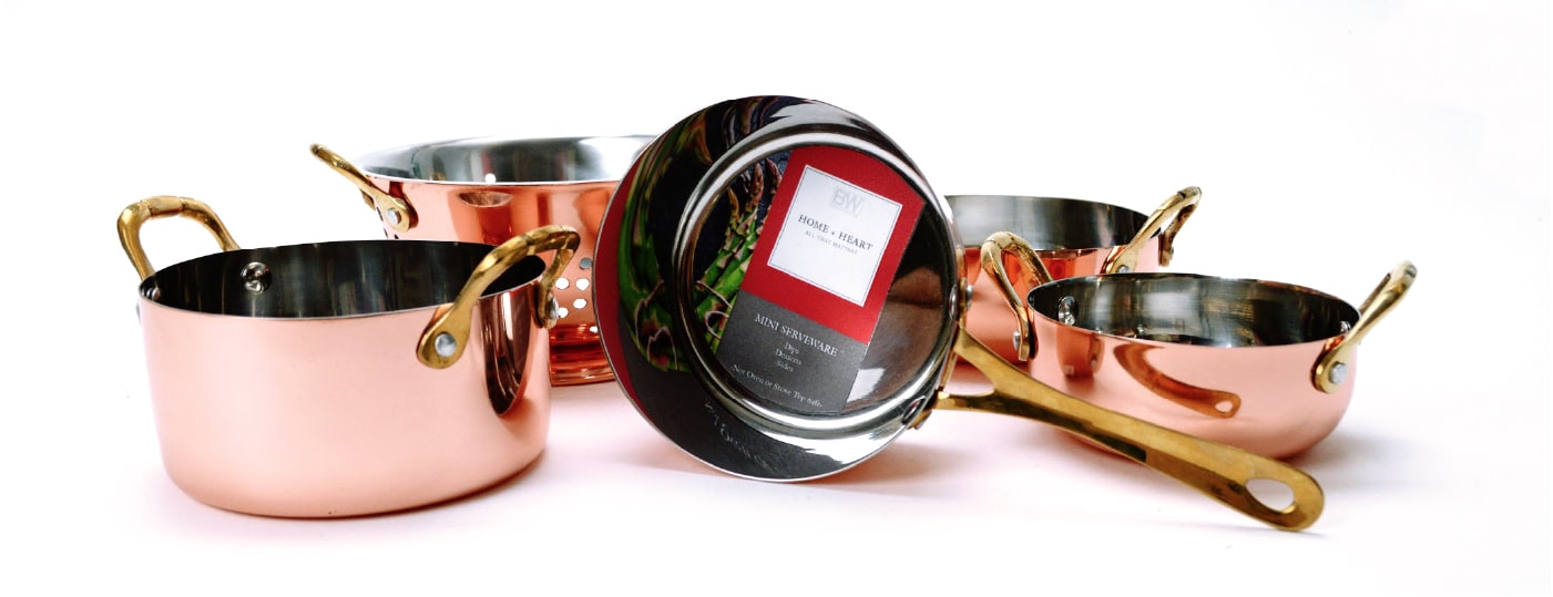
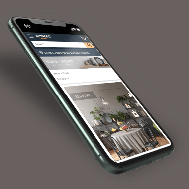
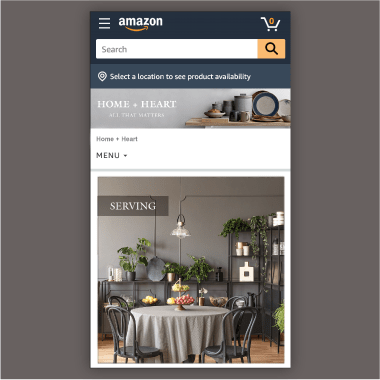
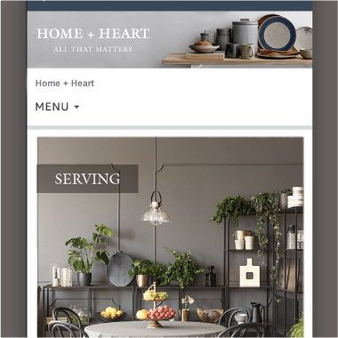
These 3 brands tell vary different stories.

Rustic Living Mark

This brand was designed to allow any “rustic” home trend, farmhouse, cottage, camp…to fit in the line comfortably. I pulled inspiration from the monoline word mark trend while crafting Rustic Living. The trend is on its way out from the design world but should have another 2 years in the market these items are sold in.

Torchier Mark

Perceived value through packaging is a great way to increase profit on any item. Here I worked with a well established brand with TV shoppers but did not have a presence in brick and mortar. Deep rich tones, minimal information, matte finish and solid construction give this line a luxury feel at a value price.

Home + Heart Mark

Home + Heart was born out of a need for an elevated brand look that complements a line of kitchen items made of wood, stone, and metal. Classic font paired with a classic lock up and a tagline that gives you a warm feeling, this is how you build an evergreen brand.

Rustic Living

The ask:

Create a go-to brand for any décor items that fell into farmhouse, cottage or camp. The brand needed a heritage look that was also playful.

Monoline
Word Mark

I pulled inspiration from the mono line word mark trend while crafting Rustic Living. The trend is on it’s way out from the design world but should have another 2 years in the market these items are sold in. 

Rustic Retail Hang Tag

Torchier Lighting

The ask:

To give Torchier a voice in the brick-and-mortar marketplace that reflected its strong established voice in-home shopping. This brand would be on the shelf with cheaper competitor brands making it crucial the CPG conveyed quality. 

TJX Exclusive

Mini light string packaging engineered and design for maximum impact at their stores.  

2020 TJX Christmas Line

2020 TJX Back to Campus 

Torchier Hurricane PKG-100-min
DSC_0063
Lantern-Front

LED Fire Base Line

Torchier fire base line needed a packaging look that reflected its high price point. I addressed this with a soft-touch coating and spot UV. 

I engineered the packaging to be an enjoyable and intuitive unpacking experience for the customer. 

Home + Heart

The ask:

To provide a brand that was abreast of the market shift from whimsical to contemporary. This was a hard pivot for Boston Warehouse Trading Company, known for their fun sentiment-based goods. I made it easy for them with the Home + Heart brand.

The foundation

My style scape made onboarding of key stakeholders easy and strongly influenced my design. 

Red was a must-have request from the top, though I did try to push back on it. 

Storytelling throw photography was key to strong sales on these mini cast iron, backers, and pan sets.  

Home+Heart was used on bands, window boxes, tray boxes, stickers, hang tags, and backer cards. 
I planned for this before even knowing the products witch kept the line agile.