Henniker Brewing Company asked me to design the look for their new soda line. This line would be sold at the brewery as an alternative option to beer. They did not know what they wanted but together we worked out the key needs.
Could not look anything like the beer cans
Needed to be easy to read from a distance
Should be visually appealing to kids and adults
This hard to ignore can design is a great success, outperforming expectations and growth revenue!
Responsible for:
Market Research – Brand Strategy – Graphics Design
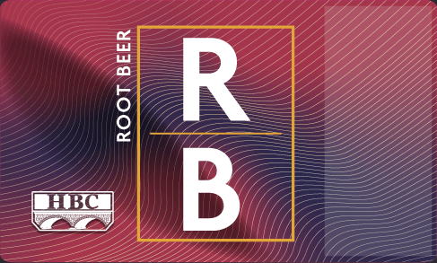
Stylescape
Bubble & Floe
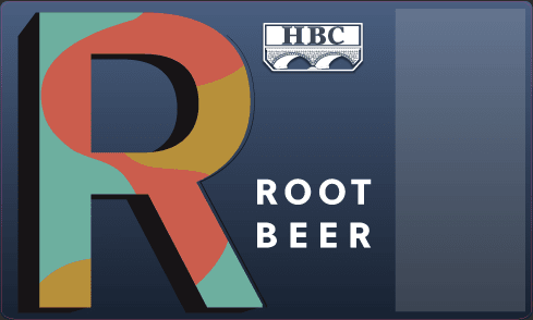
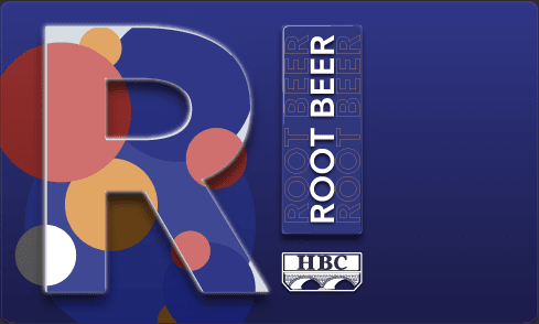
The quick concepts
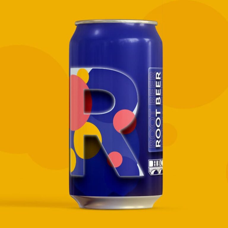
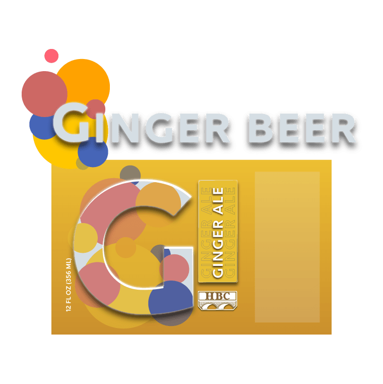
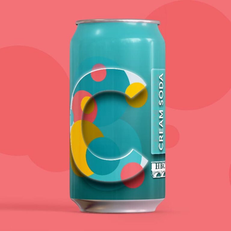
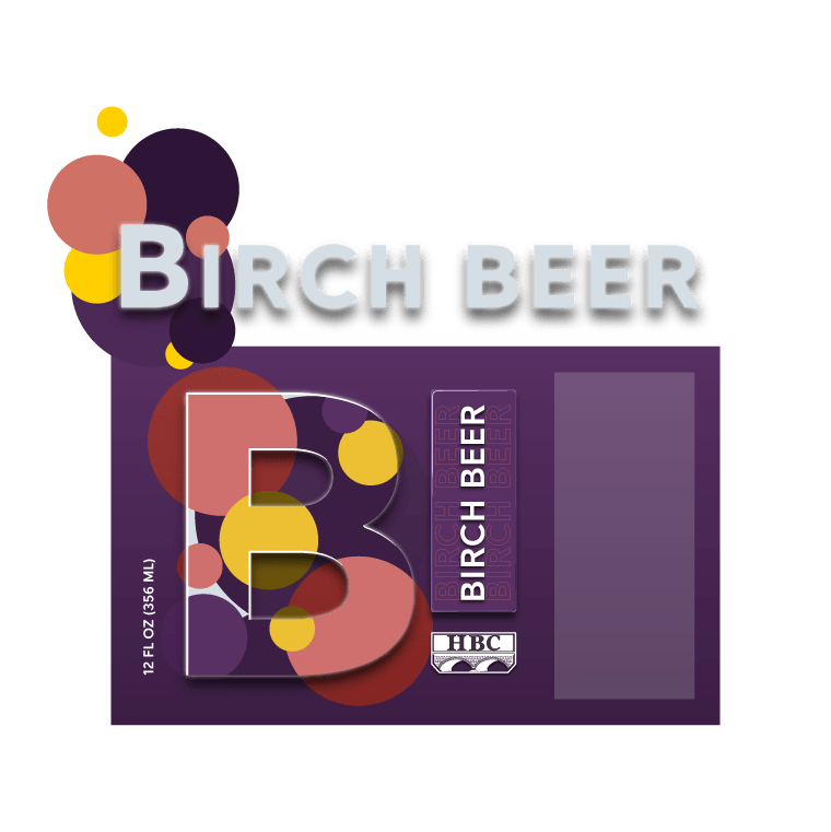
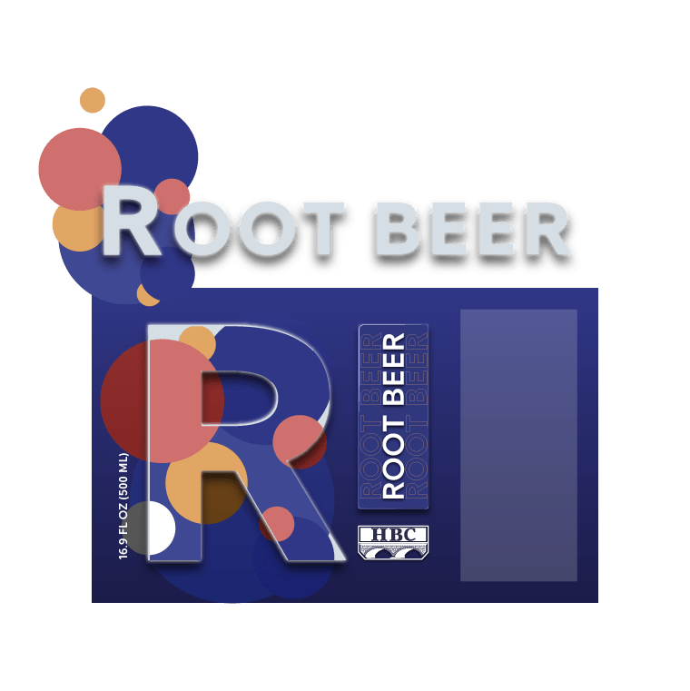
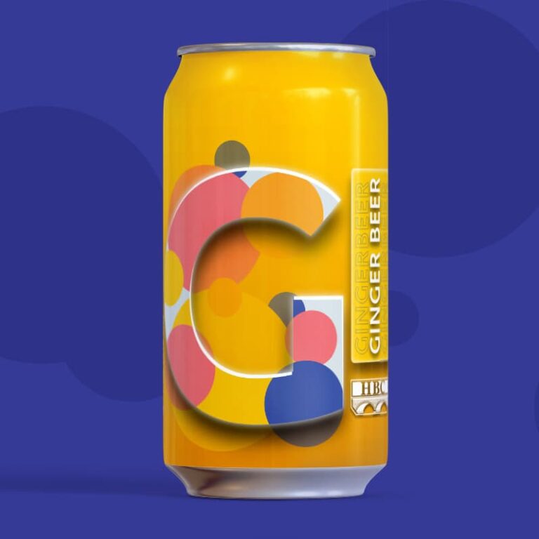
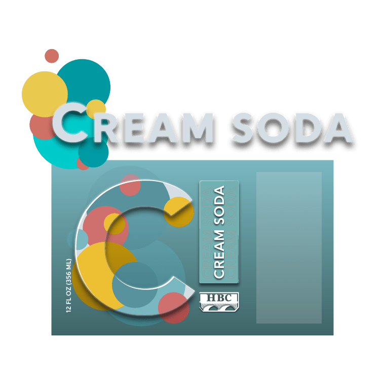
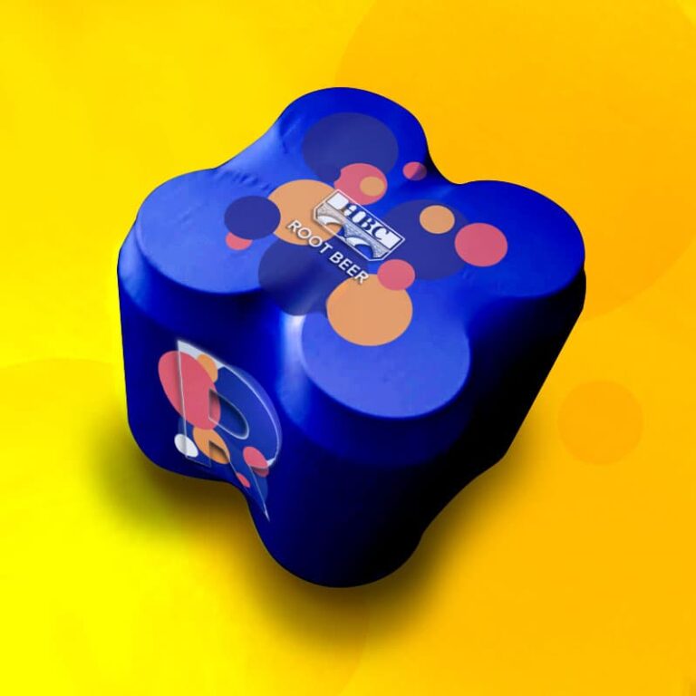
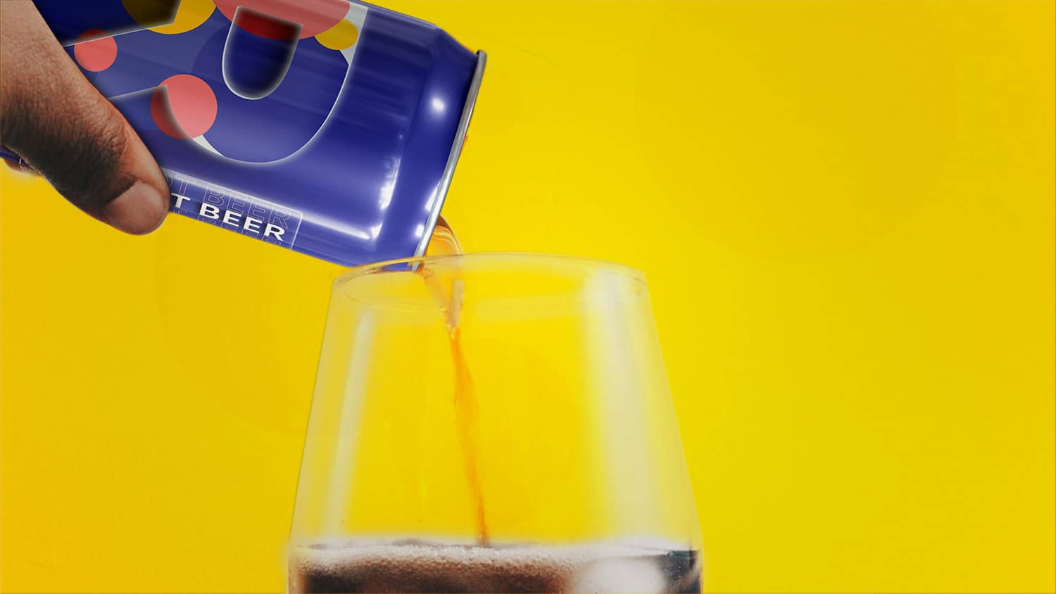
Knowing the customer would be looking at these cans from behind the other side of the bar, I focused on communicating the type of soda in each can. The large letter makes it simple for a busy bartender to grab the right can without reading each can.
These were my first thoughts on the color for each style of soda.